

MidCorner is a technology platform built for motorsport, connecting timing systems, organizations, and drivers through a unified layer of data. I developed the full brand identity — from logo and mark to a complete visual styleguide covering typography, color palette, and grid system.
The brandmark reflects precision and control — a sharp, angular form that echoes the geometry of a racing line, paired with a bold, confident wordmark. The visual system carries this same restraint through a deep, saturated color palette and structured layout, built to feel authoritative both in motion graphics and on printed materials.
Scope: Logo design, brand identity, visual styleguide, color system
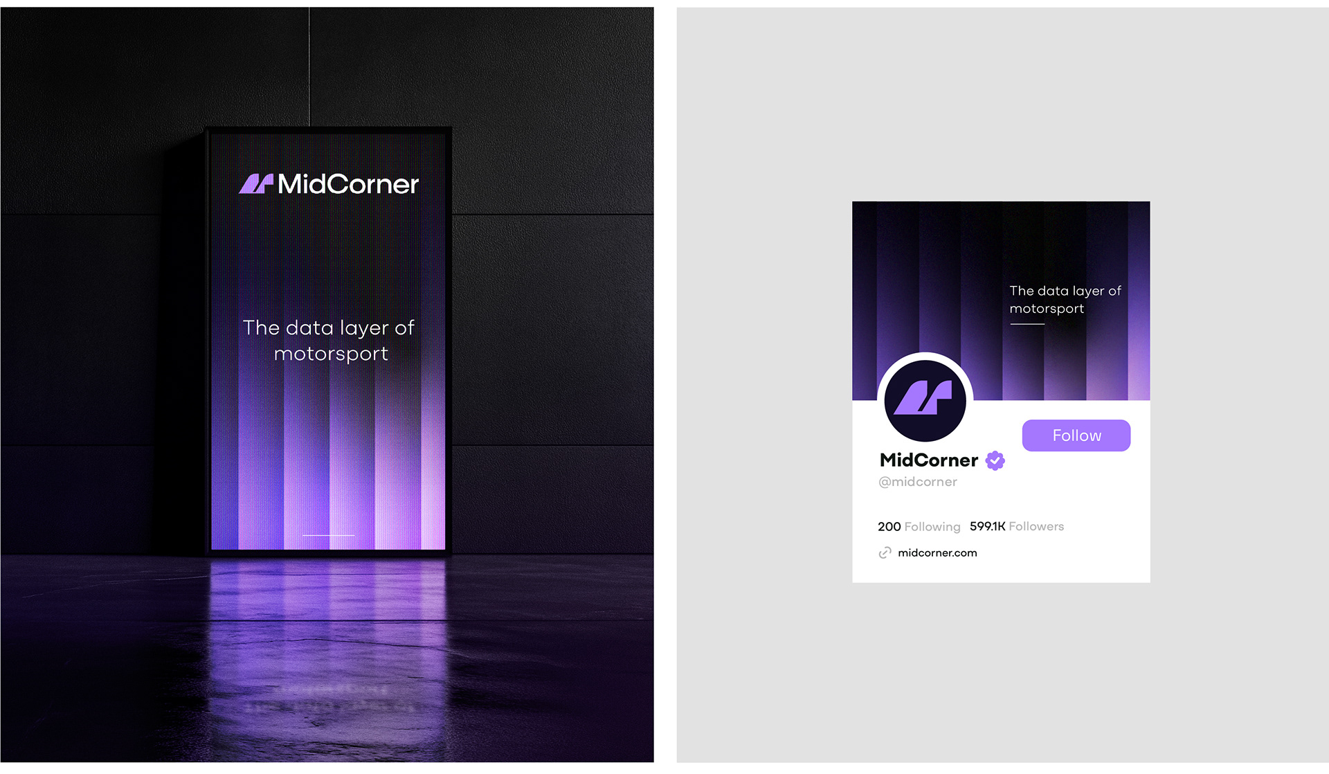
The identity carries the same clarity across every touchpoint — from large-format signage at the track to digital presence online. The deep purple-to-black gradient echoes the low-light environments of race garages and night sessions, while the angular brandmark — built from two overlapping triangular forms — reflects the split-second precision the platform is built around. Whether rendered at scale on a physical display or scaled down to a profile icon, the mark holds its structure and stays instantly recognizable.