
Lumetec
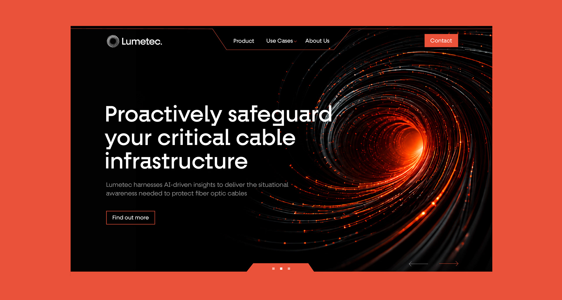
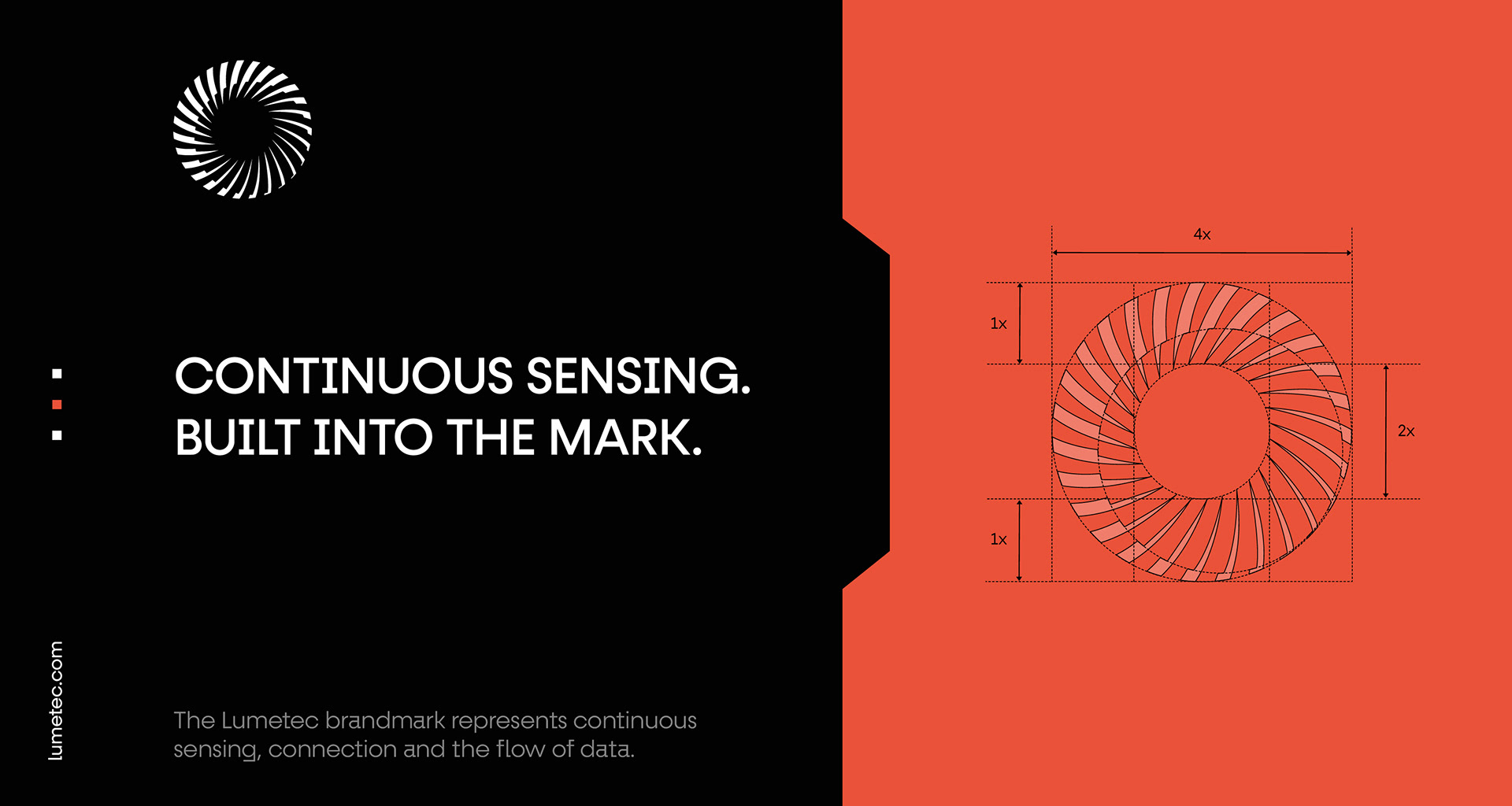
Lumetec is a technology brand focused on intelligent sensing and infrastructure protection. I developed the visual identity around a distinctive circular brandmark that represents continuous sensing, connection, and the flow of data.
The identity combines a bold orange and black palette with clean typography and dynamic imagery, creating a technical yet modern visual system across digital, print, and environmental applications.
Scope: Logo design, brand identity, visual system, typography, digital applications.
Brandmark
A continuous form designed to express sensing, connection and the constant flow of data.
Visual Language
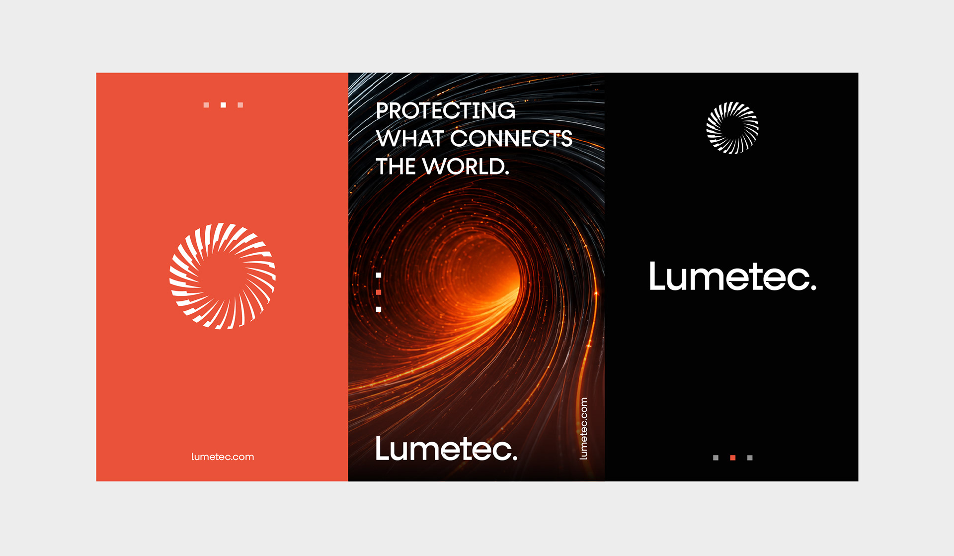
Bold typography, dynamic imagery and high contrast create a visual system that reflects movement, connectivity and continuous sensing.
Typography & Color
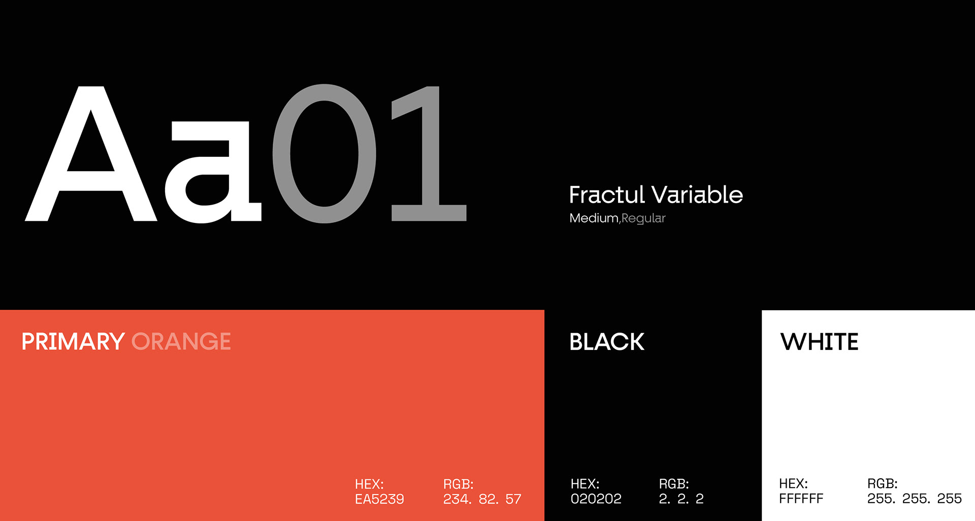
A focused typographic and color system creates a bold, technical and consistent visual identity.
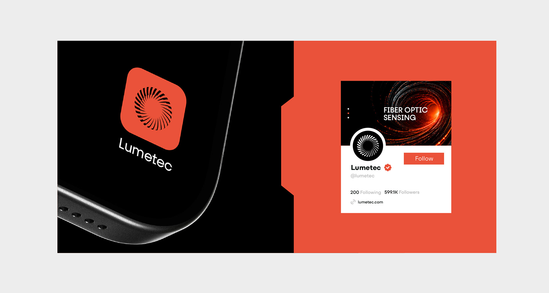
Digital Applications
The identity extends seamlessly across digital touchpoints, maintaining a clear and recognizable brand presence across platforms.
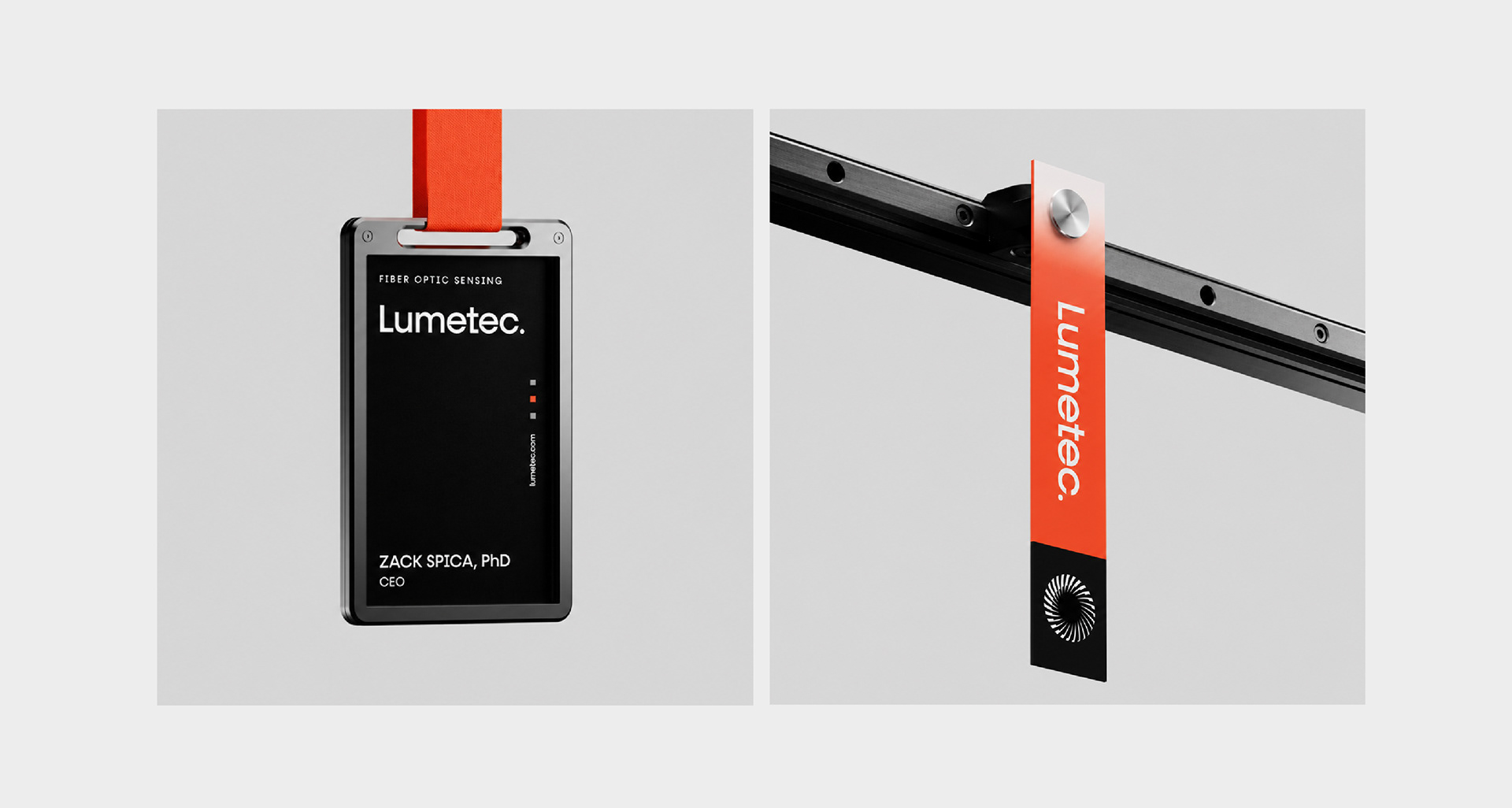
Physical Applications
The visual identity remains clear and distinctive across physical brand touchpoints, from identification badges to branded tags.
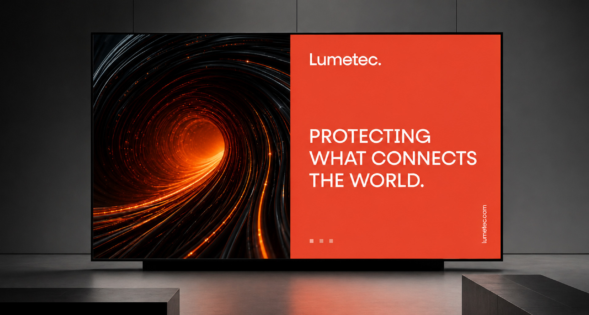
Brand in Space
The identity scales into physical environments, creating a bold and recognizable presence through imagery, color and typography.